top of page

Here is my story about Polly
Polly the Parking Fairy
Smart navigation app to find parking in the big city

Germany

France

Israel


Car Consoles

iOS

Android
Selected partners: InfraPark, Indigo, Mitsubishi , ColMobil
Finding parking in the crowded city is getting harder than ever before! Here at sPARK, an aspiring small startup from TLV, we aim at solving this once and for all.

The Idea
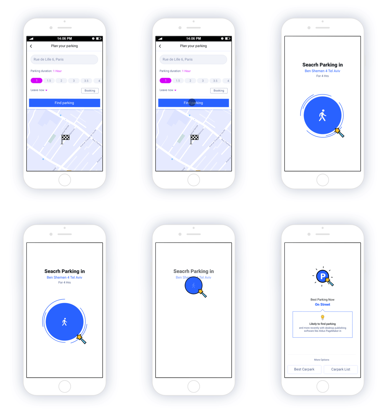
The Polly app is a system that analyzes the information at the driver's destination and recommends a parking lot that is available in the area. The app also includes a navigator should the driver prefer to find a parking spot on the street closest to their destination.
Parking on Streets
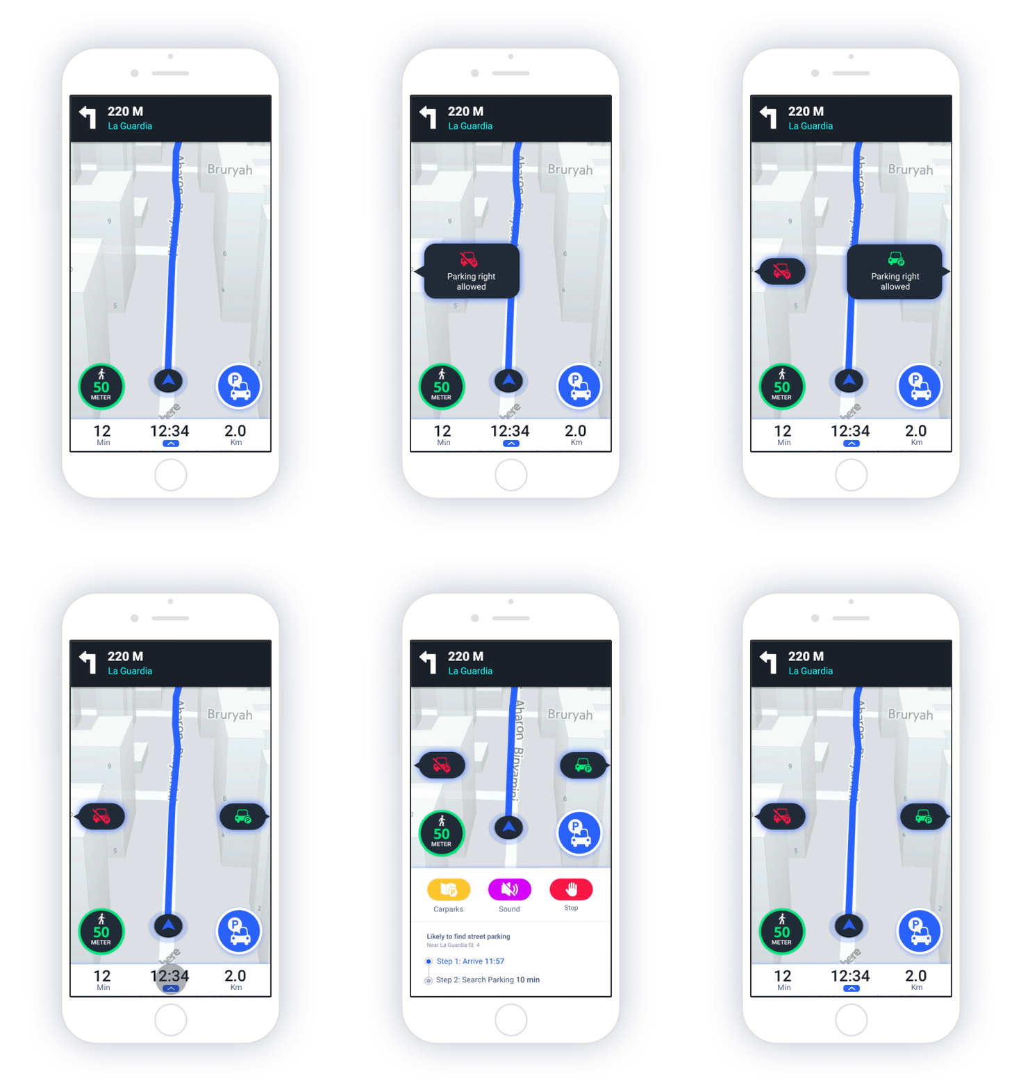
The Polly app is a system that analyzes the information at the driver's destination and recommends a parking lot that is available in the area. The app also includes a navigator should the driver prefer to find a parking spot on the street closest to their destination.
Parking at Carparks
The app offers the driver the best parking option around, taking into account tens of considerations, including traffic conditions driving there, rates, distance, user permits and more.
Best parking recommendations are presented in cards, for easy filtering by easy to use sliders. Cards can be expanded, or viewed altogether as map or as list.


My Responsibilities
Parking on Streets
Research Analyzing prior interfaces and solutions to be able to start where they left off.
Support
Working with the dev team, through the use of productivity platforms, to allow for high response times approving, commenting and providing screens and elements.
Design
Creating the brand language to describe the product; providing graphical solutions on the fly for the various interfaces and platforms.
Priority
Keeping up to our partners constrains, was introducing prioritization challenges, facing deadlines and milestones as we go along the steps.
Characterization
Defining the interface together with the dev team, creating a common ground to make development an integral part of the product journey.
Testing
Making user inputs and stats into action items, deciding were we go from here, planning our future versions.


Parking at Carparks
Creating the brand language to describe the product; providing graphical solutions on the fly for the various interfaces and platforms.

Marry Pop-Pins
A Game Developer
Like to explore new apps. Always happy to find new app that can make things easier for her. Tend to recommend apps. Being impatience and delete apps fairly fast...
Dave McDriver.
Lives 25 minutes away from the city. A daily commuters. Often recommended on new ways to get by. Doesn't care about features beside the main course of action.

An insurance Agent.
Back to Basics
Ever checking ourselves if there is a simpler way to do things around. Focusing on solving the main challenge first, functionalities that are complex are archived until fit together naturally as the product is ever changes.
Objectives may look harder than they appear
Over the course of three and a half years, of ever inventing and deleting, we first felt that we have a winning experience in our hands. Many features did not make it to the finish line.
Destination address
Parking Planning
Provide
Recommendations
Set navigation
Find Parking
WIREFRAMES
We always start on a piece of paper, discussing and throwing ideas. We try to focus on the must-haves, in the context of time and budget limitations.
I remember times were budget was extremely low, finding the sweet-spot between start working right away and thinking it through before we hit the screen.


Design Language
Facing decisions about the design language, the key component was observing the various use-cases when and where the app is operated.
Place: on the road, at home or office before hitting the road.
Usage Conditions: sun, pressure, traffic, split attention.
Color selected are a subset of colors having high contrasts among them. Making it easier to understand the important things by a single glace, as well as coping with direct light and phone mounting distance.
This kind of app has a tendency to be crowded with supporting information. We had to prioritize the data and act accordingly.
In order to ease the usage and speed up the learning curve, we were aiming at re-using existing native components rather than providing our own, where possible.
Roboto regular 30 px
Roboto regular 25 px
Roboto regular 22 px
Roboto Medium18 px
Roboto Medium 30 px
Roboto Medium 25 px
Roboto Medium 22 px
Roboto Medium18 px


Onboarding
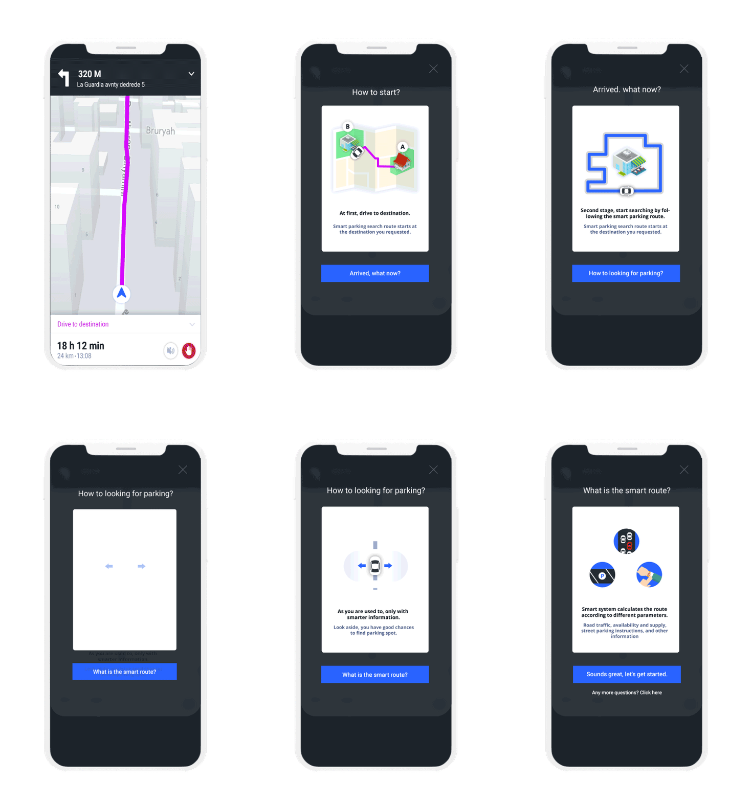
Goal here is to make a great first impression, while delivering the main value of the app. This part have tremendous effect on app conversion rates. It is always challanging to stay. minimalist in art and texts.


Set Destination
By far the most important input in the whole process. Match thought was dedicated to keeping these controllers simple as possible, while providing the various use-cases.

Parking Planning
Next comes the planning consideration, such as when the user would like to arrive at the destination, for how long is she/he going to stay, among other factors.

Booking and Buying Subscriptions
In order to facilitate for this, we had to create a whole sub-process of registration, providing and validating payment details, managing vehicles, credit cards, invoices. Since there are a lot of interfaces involved, the main goal is around keeping the user calm and providing the information just in time.


The Navigation
Navigation-oriented interface should always be minimal, providing details on demand or according to the current context. Information presented has to be strongly connected to the navigation action itself.

Arrive at Destination
Usually this is where the experience ends; however, at sPARK we have took the extra mile of providing pediatrician route to the destination, photo the parking spot, and provide full payment cycle. Both for parking on and off street.


bottom of page